|
The channel E4 has had a major reborn in 2016 the last time that E4 had a rebrand was in the late 2007. The new ident was released on October 31st 2016 the creative director Neil Gorringe thought that E4 needed a new look.
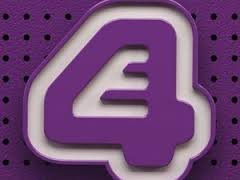
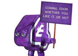
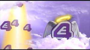
Colour The colours for the channels E4 logo has not really changed there is a slight change in the colour purple as the new logo is been lighted. The white has also been lighted and they have also added a gloss to the colours making them look more shiny.E4 have stuck to the basis of there original logo but they have made the logo more alive to show the channel more of that comedy feel to the channel. The colour purple give the audience different feels of the channel so it can show that the channel is artistic, imaginer, universal flow this is what is protruded though the colour purple. Shape The new shape of the logo has changed from the original logo, the new logo takes the shape of a little E4 robot, which has been made into a more life like logo compered to their previous logo which was just the E4 sign. The differences between the logo then and now is that in the new logo, it has eyebrows, eyes, mouth, it also has arms and legs and when the old logo its got a back ground that looks like a pin board which could mean that the logo could be a pin of the wall but they also have similarities between the two is that they still have the same logo just in different formats. Size The new logo is bigger then the previous logo and more horizontal to the old logo. The old logo was very flat with nothing to make it stand out, its also not to big or to small its in-between. With the new logo it has more of an surface, and circumference they have also enlarged the logo making it twice the size of the previous logo. This is also targeted to every type of target audience of the channel. why they rebranded The reason behind E4 rebrand was to make a logo look more astatically pleasing for the target audience this can be show on different platforms such as the internet and mobile apps as well as on TV that E4 will be played on. Another reason why E4 would have had a rebrand is because times are constantly changing so the channel will need to keep up with the times. "I wanted to keep the logo in our idents, and bringing it to life as a robot with E4's personality felt like it offered us loads of possibilities across the board," said Gorringe. "And because each ident has updateable elements, it means we can easily change them whenever we feel like it." Does it stick to the channel's corporate identity The channel does stick to the channel corporate identity because the logo and the ident match the channel and what they stand for so is being funny, family based and it can relate to all types of people. ''The focus of the new branding is Eefer, a robotic embodiment of the channel's familiar logo.'' Any positive / negative feedback from the viewers? When the previous logo was changed what the viewer though ''The initial reaction from viewers was one of confusion'' which is not what people were expecting, but this caught a lot of peoples attention and gave the viewers a lot to talk about this brought new target audiences to the channel. ''Channel 4 today unveiled its new All 4 brand identity following Chief Executive David Abraham’s keynote address to the IBC Conference in Amsterdam where he announced the new digital service.''
0 Comments
|
AuthorWrite something about yourself. No need to be fancy, just an overview. ArchivesCategories |
 RSS Feed
